Google’s Material Design, Shopify’s Polaris and Spotify’s Encore are the “popular kids” in the world of design systems. In my conversations with CTOs and CDOs at startups, I’ve noticed that they’ve taken inspiration from them while building their design systems and rightly so. But many have also shied away from building design systems because of the assumption that their systems need to be extensive, expensive and exhaustive.
The truth is this: One design system doesn’t fit all. An organization with 10 engineers and one with 100 engineers will need markedly different design systems. The design system we built for Gojek back when they had just 4 services has grown to support 20+services today.
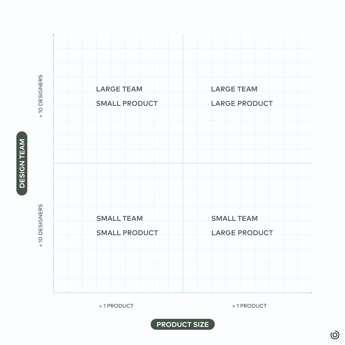
Your choice of design system, then, depends on two things:
The number of features and products an organization offers
The number of designers and engineers in the team
Identifying your organization’s needs

At each stage of an organization’s growth, design systems solve a different problem.
Reaching a "just enough" design system
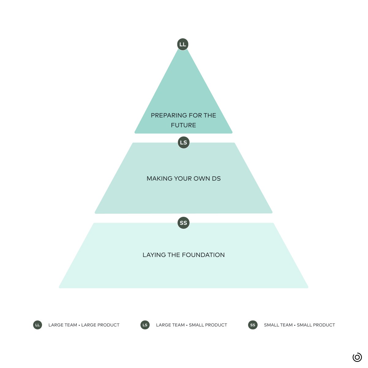
Designers and developers have defined stages of building a design system in many ways. Here is how we look at the stages of a design system:
Laying the foundation
Making the design system your own
Building a future-ready design system

Laying the foundation of a design system
Small Teams, Small Product: With a tightly defined product and a small team of designers and developers, it’s important to get the basics right, and make the product look visually consistent and on-brand. A well-designed product, early on, paves the way for high brand affinity and growth by word of mouth.
At this stage, the design system should include:
Foundation: Tokens to standardize colour, typography, layout, spacing, iconography
Simple components: Reusable components like buttons, app bars and input field text, designed and developed
Making the design system your own
Large Teams, Small Product: With more stakeholders, validating a decision requires more conversations and takes more time. A design system with simple components falls short.

Enter: Complex, custom components. These are combinations of simple components put together, like cards or lists. Custom components are specific to the product, like a transaction list item for a fintech app or a restaurant list item for a food delivery app.
Standardizing complex components reduces back and forth among the design team, and makes the design-development handoff smoother.
Building a future ready design system
Small/ Large Teams, Large Product: When organizations begin to rapidly add more features and products or services, teams need to reserve their focus for higher-order tasks: building features, not screens. This requires a more exhaustive design system that caters to all present needs and anticipates future needs.
This could mean:
Creating guidelines for interaction patterns like onboarding and offboarding
Defining product content guidelines
Creating motion and illustration guidelines
Supporting multiple colour themes
Teams can reliably use the design system to build a consistent and seamless user interface, and spend more previous design and engineering bandwidth on creating a more delightful user experience.
Building design systems, step by step
Building a design system doesn’t have to be an expensive or extensive exercise. With the right team and the right expertise, setting the foundation takes just two weeks and building custom components takes only six. Approached in this modular way, you can build the design system you need for your organization.

